


Abstract
Current web accessibility guidelines ask visualization designers to support screen readers via basic non-visual alternatives like textual descriptions and access to raw data tables.
But charts do more than summarize data or reproduce tables; they afford interactive data exploration at varying levels of granularity — from fine-grained datum-by-datum reading to skimming and surfacing high-level trends.
In response to the lack of comparable non-visual affordances, we present a set of rich screen reader experiences for accessible data visualization and exploration.
Through an iterative co-design process, we identify three key design dimensions for expressive screen reader accessibility:
This paper's prototypes have been implemented in Olli — an open source Javascript library.
1Introduction
Despite decades of visualization research and recent legal requirements to make web-based content accessible [59, 30], web-based visualizations remain largely inaccessible to people with visual disabilities.
Charts on mainstream publications are often completely invisible to screen readers (an assistive technology that transforms text and visual media into speech) or are rendered as incomprehensible strings of
Developing rich non-visual screen reader experiences for data visualizations poses several unique challenges.
Although visuomotor interactions (like hovering, pointing, clicking,
and dragging) have been core to visualization research [22], screen readers redefine what interaction is for visualization.
Rather than primarily
In this paper, we begin to bridge this divide by conducting an iterative co-design process (co-author Hajas
is a blind researcher with relevant experience) prototyping rich and usable screen reader experiences for web-based visualizations.
We identify three design dimensions for enabling an expressive space of experiences:
To evaluate our contribution, we conduct an exploratory mixed-methods study with a subset of our prototypes and 13 blind or visually impaired screen reader users. We identify specific features that make visualizations more useful for screen reader users (e.g., hierarchical and segmented approaches to presenting data, cursors and roadmaps for spatial navigation) and identify behavior patterns that screen reader users follow as they read a visualization (e.g., constant hypothesis testing and validating their mental models).
2Background and Related Work
Screen Reader Assistive Technology. A screen reader is an assistive technology that conveys digital text or images as synthesized speech or braille output. Screen readers are available as standalone third-party software or can be built-in features of desktop and mobile operating systems. A screen reader allows a user to navigate content linearly with input methods native to a given platform (e.g., touch on smartphones, mouse/keyboard input on desktop). Content authors must generate and attach alt text to their visual content like images or charts in order for them to be accessible to screen reader users. Functionality and user experience differs across platforms and screen readers. In this paper, however, we focus on interacting with web-based visualizations with the most widely used desktop screen readers (JAWS/NVDA for Windows, VoiceOver for Mac).
Web Accessibility Standards. In 2014, the World Wide Web Consortium (W3C) adopted the Web Accessibility Initiative’s Accessible Rich Internet Applications protocol (WAI-ARIA) which introduced a range of semantically-meaningful HTML attributes to allow screen readers to better parse HTML elements [44]. In particular, these attributes allow a screen reader to convey the state of dynamic widgets (e.g., autocomplete is available for text entry), alert users to live content updates, and identify common sections of a web page for rapid navigation (e.g., banners or the main content). In 2018, the W3C published the WAI-ARIA Graphics Module [58] with additional attributes to support marking up structured graphics such as charts, maps, and diagrams. These attributes allow designers to annotate individual and groups of graphical elements as well as surface data values and labels for a screen reader to read aloud.
Accessible Visualization Design. In a recent survey, Kim et al. [38] describe the rich body of work that has explored multi-sensory approaches to visualization for multiple disabilities [66, 28, 36, 6, 64, 41]. Here, we focus on screen reader output native to web-based interfaces for blind users (namely via speech). Sharif et al. [54] find that many web-based charts are intentionally designed to cause screen readers to skip over them. For charts that a screen reader does detect, blind or visually impaired users nevertheless experience significant difficulties: these users spend 211% more time interacting with the charts and are 61% less accurate in extracting information compared to non-screen-reader users [54]. Despite the availability of ARIA, alt text and data tables remain the most commonly used and recommended methods for making web-based charts accessible to screen readers [26, 60, 16]. However, each of these three approaches comes with its own limitations. Static alt text requires blind readers to accept the author’s interpretation of the data; by not affording exploratory and interactive modes, alt text robs readers of the necessary time and space to interpret the numbers for themselves [42]. Recent research also suggests that blind people have nuanced preferences for the kinds of visual semantic content conveyed via text [48, 42], and desire more interactive and exploratory representations of pictorial images [45]. Data tables, on the other hand, undo the benefits of abstraction that visualizations enable — they force readers to step sequentially through data values making it difficult to identify larger-scale patterns or trends, and do not leverage the structure inherent to web-based grammars of graphics [10, 50]. Finally, ARIA labels are not a panacea; even when they are used judiciously — a non-trivial task which often results in careless designs that cause screen readers to simply read out long sequences of numbers without any other identifiable information [49] — they present a fairly low expressive ceiling. The current ARIA specification does not afford rich and nuanced information-seeking opportunities equivalent to those available to sighted readers.
There has been some promising progress for improving support for accessibility within visualization toolkits, and vice-versa for improving native support for charts in screen reader technologies.
For instance, Vega-Lite [50] and Highcharts [31] are beginning to provide ARIA support out-of-the-box.
Apple’s VoiceOver Data Comprehension feature [20] affords more granular screen reader navigation within the chart, beyond textual summaries and data tables, via four categories of selectable interactions for charts appearing in Apple’s Stocks or Health apps.
These interactions include
3Design Dimensions for Rich Screen Reader Experiences
Currently, the most common ways of making a visualization accessible to screen readers include adding a single high-level textual description (via alt text), providing access to low-level data via a table, or tagging visualization elements with ARIA labels to allow screen readers to step through them linearly (e.g., as with Highcharts [31]).
While promising, these approaches do not afford rich information-seeking behaviors akin to what sighted readers enjoy with interactive visualizations.
To support systematic thinking about accessible visualization design, we introduce three design dimensions that support rich, accessible reading experiences:
Methods. We began by studying the development of multi-sensory graphical systems, covering work in critical cartography [63, 39], blind education [2, 25], tactile graphics [24, 28, 21, 3, 14], and multi-sensory visualization [43, 17, 13, 5].
Drawing on conventions and literature on crip, reflective, and participatory design [27, 53, 19], all authors began an iterative co-design process with Hajas, who is a blind researcher with relevant expertise.
Hajas is a screen reader user with a PhD in HCI and accessible science communication, but he is not an expert in visualization research.
Co-design — particularly as encapsulated in the disability activism slogan,
Our work unfolded over 6 months and yielded 15 prototypes. All authors met weekly for hour-long video conferences. In each session, we would discuss the structure and affordances of the prototypes, often by observing and recording Hajas’ screen as he worked through them. We would also use these meetings to reflect on how the prototypes have evolved, compare their similarities and differences, and whiteboard potential design dimensions to capture these insights. Following these meetings, Hajas wrote memos detailing the motivations for each prototype, tagging its most salient features, summarizing the types of interactions that were available, enumerating questions that the prototype raises, and finally providing high-level feedback about its usefulness and usability. In the following section, we liberally quote these memos to provide evidence and additional context for our design dimensions.
3.1Structure
We define
 Long Description
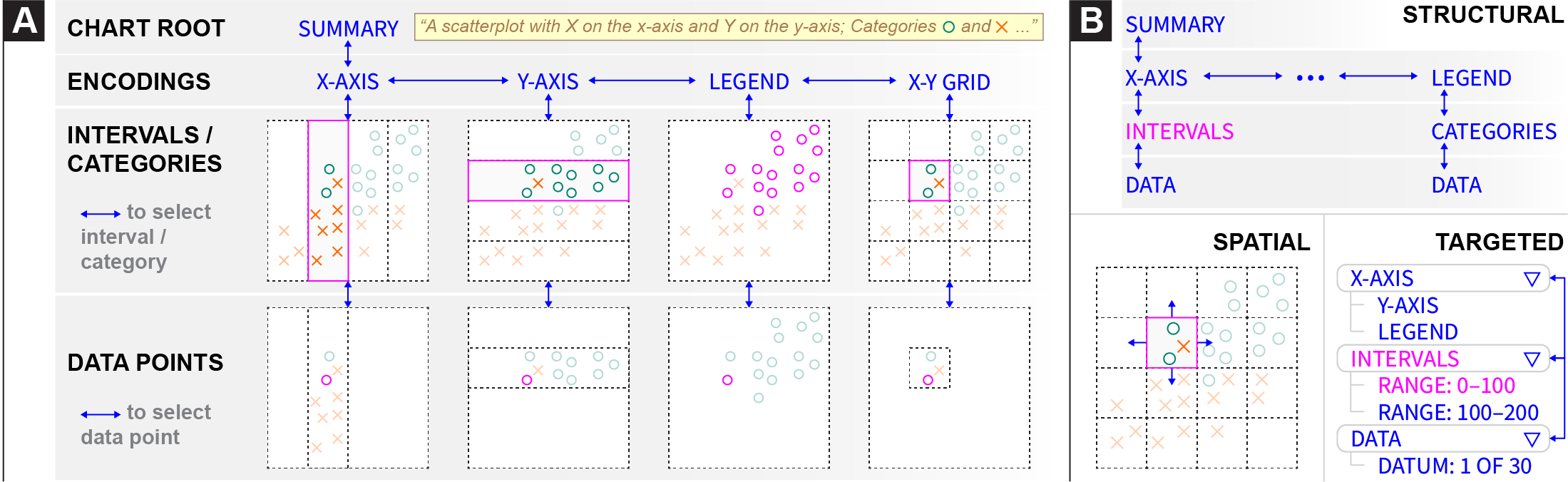
 Form. Accessible structures organize information about the visualization into different forms, including lists, tables, and trees. Consider existing best practices and common approaches. A rasterized chart with alt text is represented to a screen reader as a single node. SVG-based visualizations can additionally be tagged with ARIA labels to describe the axes, legends, and individual data points. Despite SVG’s nesting, screen readers linearize these ARIA labels into a list structure so that the user can step through them sequentially. Data tables, on the other hand, provide a grid structure for screen readers to traverse. At each cell of the grid, the screen reader reads out a different textual description, allowing the user to explore a space by traversing the grid spatially (up, down, left, and right) instead of merely linearly. Accessible visualization research has begun to explore the use of tree structures for storing chart metadata [62], but they remain relatively rare in practice. Our prototypes primarily use trees as their branching and hierarchical organization allows users to browse different components of a visualization and traverse them at different levels of detail.
Entities. Where form refers to how nodes in a structure are arranged, entities instead refers to what aspects of the visualization the nodes represent. These aspects can include:
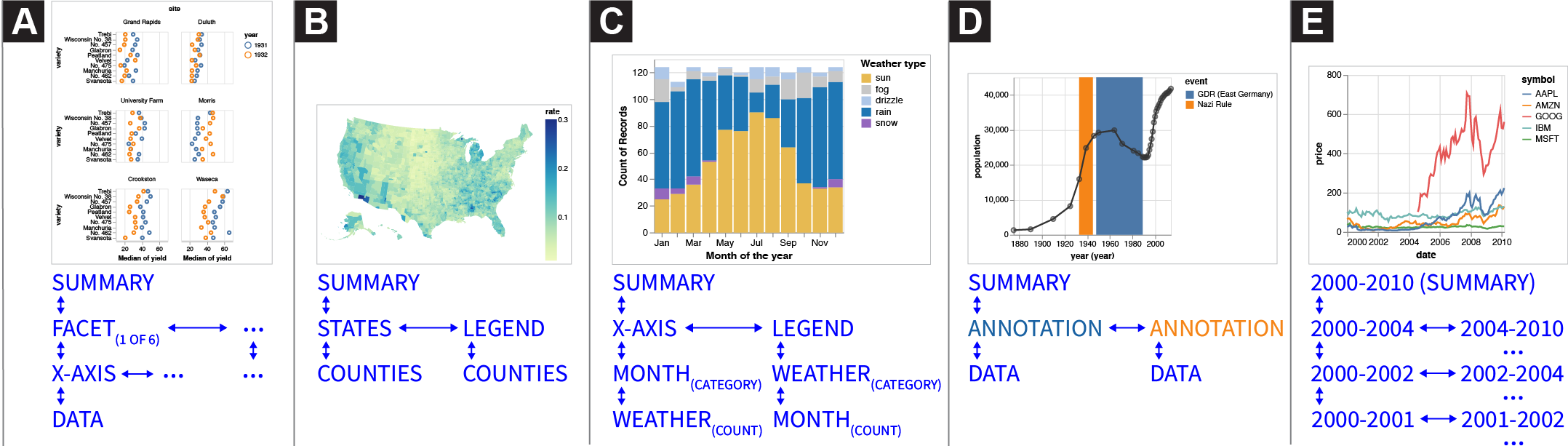
Data , where nodes in the structure represent individual data values or different slices of the data cube (e.g., by field, bins, categories, or interval ranges). For example, in a data table, every node (i.e. cell) represents a data value designated by the row and column coordinates. Depending on the form, data entities can be presented at different levels of detail. For example, one prototype we explored represents a line chart as a binary tree structure (Fig. 2e): the root node represents the entire x-axis domain, and each left and right child node recursively splits the domain in half. Users can traverse the tree downward to binary search for specific values or understand the data distribution.Encodings, where nodes in the structure correspond to visual channels (e.g., position, color, size) that data fields map to. For instance, consider Figure 1a which depicts the encoding structure of a Vega-Lite scatterplot. The visualization is specified as mappings from data fields to three visual encoding channels: x, y, and color. Thus, the encoding structure, which here takes the form of a tree, comprises a root node that represents the entire visualization and then branches for each encoding channel as well as the data rectangle (x-y grid). Descending into these branches yields nodes that select different categories or interval regions, determined by the visual affordances of the channel. For instance, descending into axis branches yields nodes for each interval between major ticks; x-y grid nodes represent cells in the data rectangle as determined by intersections of the axes gridlines; and legend nodes reflect the categories or intervals of the encoding channel (i.e., for nominal or quantitative data respectively). Finally, the leaves of these branches represent individual data values that fall within the selected interval or category.Annotations, where nodes in the structure represent the rhetorical devices a visualization author may use to to shape a visual narrative or guide reader interpretation of data (e.g., by drawing attention to specific data points or visual regions). Surfacing annotations in the visualization structure allows screen reader users to also benefit from and be guided by the author’s narrative intent. For example, Figure 2d illustrates an annotation tree structure derived from an example line chart with two annotations highlighting intervals in the temporal x-axis. The root of the tree has two children representing the two annotated regions. The these two annotation nodes have a child node for each data point that is highlighted within the region of interest.
Considerations: Information Granularity. When might users prefer nested structures (i.e. trees) over flat structures (i.e., lists and tables)?
Like sighted users, screen reader users seek information by looking for an overview before identifying subsets to view in more detail [54].
Trees allow users to read summary information at the top of the structure, and traverse deeper into branches to acquire details-on-demand.
Kim et al. use the term
We use the root node to signal the existence of the tree, and deeper nodes in the tree reflect finer levels of granularity.
Branch nodes give an overview summary about the data underneath, providing information scent [47], while leaf nodes map to individual data points.
In his feedback about the prototype shown in Figure 1, Hajas wrote
Entities are not mutually exclusive, and a structure might opt to surface different entities in parallel branches.
We prototyped a version of Figure 2d which placed an encoding tree and annotation tree as sibling branches under the root node.
Users could descend down a given branch, and switch to the equivalent location in the other branch at will.
These design decisions are motivated by findings in prior work: by placing encodings and annotations as co-equal branches, we produce a structure that preserves the agency of screen reader users either to start with the narrative arc of annotations, or follow it after having the chance to interpret the data for themselves [42].
As Hajas confirms
3.2Navigation
Screen reader users need ways to traverse accessible structures to explore data or locate specific points.
When browsing a webpage, screen readers provide a cursor that represents the current location in the page.
Users use keyboard commands to step the cursor backward and forward in a sequential list of selectable items on the page, or jump to important locations such as headers and links.
Through our prototyping process, we developed three ways of navigating through an accessible structure:
Structural Navigation. Structural navigation refers to ways users move within the accessible structure.
We identify two types of structural navigation.
Spatial Navigation. Sometimes users want to traverse the visualization according to directions in the screen coordinate system. We refer to this as spatial navigation. For example, when traversing part of an encoding structure that represents the visualization’s X-Y grid, a downward structural navigation would go down a level into the currently selected cell of the grid, showing the data points inside the cell. A downward spatial navigation, in contrast, would move to the grid cell below the current one — i.e. towards the bottom of the Y-axis. Spatial navigation is also useful when navigating lists of data points, which may not be sorted by X or Y value in the encoding structure. Where a leftward structural navigation would move to the previous data point in the structure, a leftward spatial navigation would move to the point with the next lowest X value.
Targeted Navigation. Navigating structurally and spatially requires a user to maintain a mental map of where their cursor is relative to where they want to go. If the user has a specific target location in mind, maintaining this mental map in order to find the correct path in the structure to their target can create unnecessary cognitive load. We use targeted navigation to refer to methods that only require the user to specify a target location, without needing to specify a path to get there. For example, the user might open a list of locations in the structure and select one to jump directly there. Screen readers including JAWS and VoiceOver implement an analogous form of navigation within webpages. Instead of manually stepping through the page to find a specific piece of content, users can open a menu with a list of locations in the page. These locations are defined in HTML using ARIA landmark roles, which can designate parts of the DOM as distinct sections when read by a screen reader. When a screen reader user open the list of landmarks and selects a landmark, their cursor moves directly to that element.
Considerations: Boundaries & Cognitive Load. Screen reader users only read part of the visualization at a time, akin to a sighted user reading a map through a small tube [28]. How do they keep track of where they are? In our co-design process, we found it easiest for a user to remember their location relative to a known starting point, which is corroborated by literature on developing spatial awareness for blind people [63, 40, 17]. Hajas noted the prevalence of the Home and End shortcuts across applications for returning to a known position in a bounded space (e.g. the start/end of a line in a text editor). We also found that grouping data by category or interval was helpful for maintaining position. Hajas noted that exploring data within a bounded region was like entering a room in a house. In his analogy, a house with many smaller rooms with doors is better than a house with one big room and no doors. Bounded spaces alleviate cognitive load by allowing a user to maintain their position relative to entry points.
Comparing navigation techniques, Hajas noted that spatial felt
3.3Description
When a user navigates to a node in a structure, the screen reader narrates a description associated with that node.
For example, when navigating to the chart’s legend, the screen reader output might articulate visual properties of the chart’s encoding:
Content. Semantic
Decoupling a chart’s semantic content from its visual representation helps us better understand what data representations afford for different readers.
For instance, Lundgard and Satyanarayan find that what blind readers report as most useful in a chart description is not a straightforward translation of the visual data representation.
Specifically, simply listing the chart’s encodings is much less useful to blind readers than conveying summary statistics and overall trends in the data [42].
As Hajas noted,
Composition. The usefulness of a description depends not only on the content conveyed by its constituent sentences, but also on its
Verbosity. Whereas composition refers to the ordering of content,
Considerations: Context & Customization. Apart from its constituent parts (content, composition, verbosity), a description’s usefulness also depends on the
This context-sensitivity reveals an important aspect of usability: a user’s familiarity (or lack thereof) with the data interface.
Wayfinding content (e.g.,
4Example Gallery
 Long Description
 5Evaluation
To evaluate our contribution, we conducted 90-minute Zoom studies with 13 blind and visually impaired participants. Participants were asked to explore three prototype accessible screen reader experiences, shown one after another each with a different dataset. The goal of our evaluation was not to determine which particular combination of design elements was “best,” but rather to be exploratory — to compare the relative strengths and advantages of instantiations of our design dimensions, and understand how they afford different modes of accessible data exploration.
5.1Evaluation Setup & Design
Following Frøkjær and Hornbæk’s Cooperative Usability Testing (CUT) method [23], Zong and Lee conducted each session by alternating between the role of guide (i.e., talking to the user and explaining the prototype) and logger (i.e., keeping track of potential usability problems, interpreting the data to prepare for becoming the guide). We began each session with a semi-structured interview to understand participants’ current experiences with data and the methods they use to make inaccessible forms of data representation usable (script included in supplementary material). The rest of the session focused on each of the three prototypes in turn, with each condition split into two phases: interaction and interpretation. In the interaction phase, Zong or Lee guided participants through the prototypes and asked participants to use them and comment on their process, in the style of Hutchinson et al.’s technology probes [33]. Then, the authors switched roles and began a cooperative interpretation phase, where the authors and participants engaged in a constructive dialogue to jointly interpret the usability problems and brainstorm possible alternatives to the current prototype. In this method, participants influence data interpretation, allowing for more rapid analysis than traditional think-aloud studies as some analysis is built into each evaluation session with instant feedback or explanation from participants [23].
Prototypes. The in-depth nature of our cooperative interpretation sessions required us to balance the total number of prototypes evaluated (so that participants would have time to thoroughly learn and interact with each one) with a time duration appropriate for a Zoom session (limited to 90 minutes to avoid exhausting participants). Accordingly, we selected the following three prototypes, each representing a different aspect of our design dimensions:
table: An accessible HTML data table with all rows and three columns from the classic Cars dataset, in order to compare our prototypes with existing accessibility best practice.
table is our control condition, as it follows existing best practice for making data accessible to screen readers. multi-view enables us to study how users move between levels of detail, and whether they could navigate and compare small multiple charts. Finally, target allows us to compare how and when our participants use the three different styles of navigation (structural, spatial, and targeted). We presented the prototypes in this sequence to all participants to introduce new features incrementally.
Participants. We recruited 13 blind and visually impaired participants through our collaborators in the blind community and through a public call on Twitter. Each participant received $50 for a 90-minute Zoom session. We provide aggregate participant data following ethnographic practice to protect privacy and not reduce participants to their demographics [51]. Half of our participants were totally blind (n=7), while others were almost totally blind with some light perception (n=4) or low vision (n=2). Half of them have been blind since birth (n=7). Participants were split evenly between Windows/Chrome (n=7) and Mac/Safari (n=6). Windows users were also split evenly between the two major screen readers (JAWS, n=3; NVDA, n=4), while all Mac participants used Apple VoiceOver. These figures are consistent with recent surveys conducted by WebAIM which indicate that JAWS, NVDA, and VoiceOver are the three most commonly used screen readers [61]. Demographically, 70% of our participants use he/him pronouns (n=9) and the rest use she/her pronouns (n=4). One participant was based in the UK while the rest were spread across eight US states. Participants self-reported their ethnicities (Caucasian/white, Asian, and Black/African, Hispanic/Latinx), represented a diverse range of ages (20–50+) and had a variety of educational backgrounds (high school through to undergraduate, graduate, and trade school). Nine participants self-reported as slightly or moderately familiar with statistical concepts and data visualization methods, two as expertly familiar, and one as not at all familiar. Five participants described data analysis and visualization tools as an important component in their professional workflows, and 8 interacted with data or visualizations more than 1–2 times/week.
5.2Quantitative Results
To supplement the cooperative interpretation sessions, participants rated each prototype using a series of Likert questions.
We designed a questionnaire with six prompts measuring a subset of Brehmer and Munzner’s multi-level typology of abstract visualization tasks [12].
This framework, however, required some adaptation for non-visual modes of search.
In particular, searching with a screen reader requires a sequential approach to data that is at odds with the “at-a-glance” approach sighted readers take to browsing and exploring data.
As our prototypes focus on navigation through charts, we collapsed the
| Prompt: When using this prototype ... | Task | Table | Multi-view | Targeted |
|---|---|---|---|---|
| How enjoyable was it to interact with the data? | enjoy | 3 [3.31] (0.95) | 4 [3.77] (1.01) | 4 [3.54] (0.97) |
| How easy was it to generate and answer questions? | discover | 4 [3.15] (1.34) | 3 [3.00] (1.08) | 3 [3.23] (1.17) |
| If you already knew what information you were trying to find, how easy would it be to look up or locate those data? | lookup-locate | 3 [3.31] (1.32) | 4 [3.77] (1.17) | 4 [3.38] (1.19) |
| If you didn't already know which information you were trying to find, how easy would it be to browse or explore the data? | browse-explore | 2 [3.00] (1.68) | 2 [2.69] (1.11) | 3 [3.00] (1.29) |
| How easy was it to learn to use? | ease-of-use | 4 [4.15] (0.99) | 3 [2.69] (0.75) | 3 [3.15] (1.34) |
| How useful would it be to have access to this interaction style for engaging with data? | perceived usefulness | 4 [4.15] (0.80) | 4 [4.00] (0.82) | 4 [4.15] (1.07) |
Table 1 displays the questionnaire prompts, their corresponding tasks, and statistics summarizing the participants’ ratings.
A Friedman test
found a significant rating difference for the ease-of-use of the prototypes , with a large effect size (Kendall’s ).
Follow-up Nemenyi tests
revealed that multi-view was more difficult to use than table with statistical significance , but target was not.
Additional tests for the other prompts found neither statistically significant differences, nor large effect sizes, between the prototypes.
However, median scores (which are more robust to outliers than means [45]) suggest that participants generally enjoy interacting with multi-view and target more, and found them easier to lookup or locate data with.
Moreover, target had the highest median score for affording browse or explore capabilities.
Conversely table was easiest to learn to use, and generally made it easy to discover, or ask and answer questions about the data.
Notably, in response to the question
5.3Qualitative Results
After the interviews, we qualitatively coded the notes taken by the logger with a grounded theory approach [15]. We performed open coding in parallel with the interviews (i.e., coding Monday’s interviews after finishing Tuesday’s interviews). We then synthesized the codes into memos, from which we derived these themes.
Tables are familiar, tedious, but necessary. Every participant noted that tables were their primary way of accessing data and visualizations. While tables are an important accessible option, participants overwhelmingly reported the same problems: they are ill-suited for processing large amounts of data and impose high cognitive load as users must remember previous lines of the table in order to contextualize subsequent values.
As P2 reported,
While it is not enjoyable to explore or build a mental model of data with static tables, participants still emphasized their necessity because of the format’s familiarity:
Prior exposure to data analysis and representations increases the efficacy of spatial representations. Participants who had experience conducting data analysis or reading tactile graphs/maps were able to easily develop a spatial understanding of how each prototype worked.
Five participants (P2–4, 11, 13) made direct connections between the multi-view and target prototypes, and the tactile graphs they encountered in school.
Three participants (P2, 11, 12) found their software engineering experience made it easier to understand and navigate the prototypes’ hierarchical structure.
Previous literature on tactile mapping has also shown how developing tactile graphical literacy is crucial for building spatial knowledge, but they emphasize that it is not a sufficient for being able to conduct and understand data analysis. [28, 25] Since our participants already had an existing spatial framework, it became easier to explain how a prototype might work using their prior experience as a benchmark, which has been corroborated by similar studies in tactile cartography. [63, 2, 55] Importantly, our participants were able to find specific origin points that they could return to in order to navigate the different branches of the tree, which would be further aided with help menus and mini-tutorials to understand the keyboard shortcuts (P2).
Being able to shift between origin points is especially important for switching between graphs or between variables.
By contrast, participants who had more difficulty with the prototypes (P8, 10) pointed to their lack of experience working with non-tabular data. P10 reported that being able to mentally visualize data points within a grid was a specific challenge.
target made it especially easy for participants to test their hypotheses by giving them direct access to components that might break their hypotheses.
P5 reported that it allowed him to
6Discussion and Future Work
In this paper, we explore how structure, navigation, and description compose together to yield richer screen reader experiences for data visualizations than are possible via alt text, data tables, or the current ARIA specification. Our results suggest promising next steps about accessible interaction and representation for visualizations.
6.1Enabling Richer Screen Reader Experiences Today
Although our design dimensions highlight a diverse landscape of screen reader experiences for data visualizations, our study participants attested to the value of following existing best practices. Namely, alt text and data tables provide a good baseline for making visualizations accessible. Thus, visualization authors should consider adopting our design dimensions to enable more granular information access patterns only after these initial pieces are in place.
Existing visualization authoring methods, however, are likely insufficient for instantiating our design dimensions or producing usable experiences for screen reader users.
In particular, it currently falls entirely on visualization authors to handcraft appropriate structures, navigational techniques, and description schemes on a per-visualization basis.
As a result, besides being a time-consuming endeavor, idiosyncratic implementations can introduce friction to the reading process.
For instance, per-visualization approaches might not account for an individual user’s preferences in terms of verbosity, speed, or order of narrated output — three properties which varied widely among our study participant in ways that did not correlate with education level or experience with data.
Thus, to scale and standardize this process, some responsibility for making visualizations screen reader accessible must be shared by
Current web accessibility standards also present limitations for realizing our design dimensions.
For instance, there is no standard way to determine which element the screen reader cursor is selecting.
Where ARIA has thus far focused on annotating documents with the semantics of a pre-defined palette of widgets, future web standards might instead express how elements respond to the
6.2Studying and Refining the Design Dimensions
Our conversations with study participants also helped highlight that design considerations can differ substantially for users who are totally blind compared to those who have low-vision.
For example, partially-sighted participants used screen magnifiers alongside screen readers.
As a result, they preferred verbose written descriptions alongside more terse verbal narration.
Magnifier users also wished for in situ tooltips, which would eliminate the need to scroll back and forth between points and axes to understand data values.
However, promisingly, we found that using a screen reader and magnifier together affords unique benefits:
Similarly, in scoping our focus to screen readers and, thus, text-to-speech narration, we refrained from considering multi-sensory modalities in our design dimensions.
Yet, we found that most participants had previous experience with multi-sensory visualization, including sonification (P5, 7, 9, 13), tactile statistical charts (P2–4, 10, 11, 13), and haptic graphics (P3, 4, 11, 13).
Some participants reported that a
6.3What are Accessible Interactions for Data Visualizations?
In visualization research, we typically distinguish between static and interactive visualizations, where the latter allows readers to actively manipulate visualized elements or the backing data pipeline [65, 29].
Screen readers, however, complicate this model: reading is no longer a process that occurs purely “in the head” but rather becomes an embodied and interactive experience, as screen reader users must intentionally perform actions with their input devices in order to step through the visualization structure.
While some aspects of this dichotomy may still hold, it is unclear how to cleanly separate
Acknowledgements
We thank Matthew Blanco, Evan Peck, the NYU Digital Theory Lab, and the MIT Accessibility Office. This work was supported by NSF awards #1942659, #1122374, and #1941577.
References
- [1] (2018) SAS Graphics Accelerator Customer Product Page. Link Cited by: §2.
- [2] (2001) Tactile Graphics In School Education: Perspectives From Pupils. British Journal of Visual Impairment 19 (2), pp. 69–73. ISSN 0264-6196, Link, Document Cited by: §3, §5.3.
- [3] (1997) Guidelines for Design of Tactile Graphics. Technical report American Printing House for the Blind. Link Cited by: §3.
- [4] (2007) The Legacy of the Technology Acceptance Model and a Proposal for a Paradigm Shift.. Journal of the Association for Information Systems 8 (4). ISSN 1536-9323, Link, Document Cited by: §5.2.
- [5] (2016) Tactile Graphics with a Voice. ACM Transactions on Accessible Computing (TACCESS) 8 (1), pp. 3:1–3:22. ISSN 1936-7228, Link, Document Cited by: §3.
- [6] (1999) Using Sonification. Multimedia Systems 7 (1), pp. 23–31 (en). ISSN 1432-1882, Link, Document Cited by: §2.
- [7] (1996) The Visual Design and Control of Trellis Display. Journal of Computational and Graphical Statistics 5 (2), pp. 123–155 (en). ISSN 1061-8600, 1537-2715, Link, Document Cited by: 2nd item.
- [8] (1983) Semiology of Graphics. University of Wisconsin Press. , Link Cited by: §3.3.
- [9] (2021) Jurassic Mark: Inattentional Blindness for a Datasaurus Reveals that Visualizations are Explored, not Seen. In IEEE Transactions on Visualization & Computer Graphics (Proc. IEEE VIS), (en). Link, Document Cited by: §6.3.
- [10] (2011) D3: Data-Driven Documents. IEEE Trans. Visualization & Comp. Graphics (Proc. InfoVis). Link, Document Cited by: §2.
- [11] (2022) The Accessibility Object Model (AOM). (en-US). Link Cited by: §2.
- [12] (2013) A Multi-Level Typology of Abstract Visualization Tasks. In IEEE Transactions on Visualization & Computer Graphics (Proc. IEEE VIS), (en). Link, Document Cited by: §5.2.
- [13] (2010) Usage Of Multimodal Maps For Blind People: Why And How. In ACM International Conference on Interactive Tabletops and Surfaces (ISS), ITS ’10, New York, NY, USA, pp. 247–248. , Link, Document Cited by: §3.
- [14] (2021) Technology Developments in Touch-Based Accessible Graphics: A Systematic Review of Research 2010-2020. In ACM Conference on Human Factors in Computing Systems (CHI), pp. 1–15. , Link Cited by: §3.
- [15] (2006) Constructing Grounded Theory. Sage Publications, London ; Thousand Oaks, Calif (en). , Link Cited by: §5.3.
- [16] (2019-06) Visualizing for the Non‐Visual: Enabling the Visually Impaired to Use Visualization. Computer Graphics Forum (EuroVis) 38 (3), pp. 249–260 (en). ISSN 0167-7055, 1467-8659, Link, Document Cited by: §2.
- [17] (2021) Towards Understanding Sensory Substitution for Accessible Visualization: An Interview Study. IEEE Transactions on Visualization and Computer Graphics (Proc. IEEE VIS), pp. 1–1 (en). ISSN 1077-2626, 1941-0506, 2160-9306, Link, Document Cited by: §3.2, §3.
- [18] (1995) What Is Participatory Research?. Social Science & Medicine 41 (12), pp. 1667–1676 (en). ISSN 0277-9536, Link, Document Cited by: §3.
- [19] (2020) Design Justice: Towards an Intersectional Feminist Framework for Design Theory and Practice. MIT Press, Cambridge, MA (en). Link Cited by: §3.
- [20] (2019) What’s New In iOS 13 Accessibility For Individuals Who Are Blind or Deaf-Blind. Link Cited by: §2, §3.3.
- [21] (2021) Interdependent Variables: Remotely Designing Tactile Graphics for an Accessible Workflow. In ACM Conference on Computers and Accessibility (SIGACCESS), ASSETS ’21, New York, NY, USA, pp. 1–6. , Link, Document Cited by: §3.
- [22] (2020) What is Interaction for Data Visualization?. IEEE Transactions on Visualization and Computer Graphics (Proc. IEEE VIS) 26 (1), pp. 119 – 129. Link, Document Cited by: §1.
- [23] (2005) Cooperative Usability Testing: Complementing Usability Tests With User-Supported Interpretation Sessions. In ACM Extended Abstracts on Human Factors in Computing Systems (CHI), CHI EA ’05, New York, NY, USA, pp. 1383–1386. , Link, Document Cited by: §5.1.
- [24] (2018) Universal Design Tactile Graphics Production System BPLOT4 for Blind Teachers and Blind Staffs to Produce Tactile Graphics and Ink Print Graphics of High Quality. In Computers Helping People with Special Needs, K. Miesenberger and G. Kouroupetroglou (Eds.), Vol. 10897, pp. 167–176 (en). , Link Cited by: §3.
- [25] (2015) Advice From Blind Teachers on How to Teach Statistics to Blind Students. Journal of Statistics Education 23 (3), pp. null. ISSN null, Link, Document Cited by: §3, §5.3.
- [26] (2008) Effective Practices for Description of Science Content within Digital Talking Books. Technical report The WGBH National Center for Accessible Media (en). Link Cited by: §1, §2, §3.3.
- [27] (2013) Designing Collective Access: A Feminist Disability Theory of Universal Design. Disability Studies Quarterly 33 (4) (en). ISSN 2159-8371, 1041-5718, Link, Document Cited by: §3.
- [28] (2011) Guidelines and Standards for Tactile Graphics. Technical report Braille Authority of North America. Link Cited by: §2, §3.2, §3, §5.3.
- [29] (2012) Interactive Dynamics for Visual Analysis. Communications of the ACM 55 (4), pp. 45–54 (en). ISSN 0001-0782, 1557-7317, Link, Document Cited by: §1, §6.3.
- [30] (2019) Supreme Court Hands Victory To Blind Man Who Sued Domino’s Over Site Accessibility. CNBC (en). Link Cited by: §1.
- [31] (2021) Accessibility Module. (en). Link Cited by: §2, §3.
- [32] (2020) Palmerpenguins: Palmer Archipelago (Antarctica) Penguin Data. Link Cited by: 3rd item.
- [33] (2003) Technology Probes: Inspiring Design for and with Families. In ACM Conference on Human Factors in Computing Systems (CHI), New York, NY, USA, pp. 17–24. , Link, Document Cited by: §5.1.
- [34] (2019) Disability dongle: A well-intended, elegant, yet useless solution to a problem we never knew we had. Disability dongles are most often conceived of and created in design schools and at IDEO.. Tweet. Link Cited by: §3.
- [35] (2021) Communicating Visualizations without Visuals: Investigation of Visualization Alternative Text for People with Visual Impairments. In IEEE Transactions on Visualization and Computer Graphics (Proc. IEEE VIS), Vol. PP (eng). Link, Document Cited by: §3.3.
- [36] (1999) Data Sonification And Sound Visualization. Computing in Science Engineering 1 (4), pp. 48–58. ISSN 1558-366X, Document Cited by: §2.
- [37] (1999) The Psychological Origins of Perceived Usefulness and Ease-of-use. Information and Management 35 (4), pp. 237–250. ISSN 0378-7206, Link, Document Cited by: §5.2.
- [38] (2021) Accessible Visualization: Design Space, Opportunities, and Challenges. Computer Graphics Forum (EuroVis) 40 (3), pp. 173–188 (en). ISSN 0167-7055, 1467-8659, Link, Document Cited by: §2, §3.1, §5.3.
- [39] (2012) State of the Art of Tactile Maps for Visually Impaired People. In True-3D in Cartography: Autostereoscopic and Solid Visualisation of Geodata, M. Buchroithner (Ed.), Lecture Notes in Geoinformation and Cartography, pp. 137–151 (en). , Link, Document Cited by: §3.
- [40] (2019) Editing Spatial Layouts through Tactile Templates for People with Visual Impairments. In ACM Conference on Human Factors in Computing Systems (CHI), Glasgow, Scotland Uk, pp. 1–11 (en). , Link, Document Cited by: §3.2.
- [41] (2019) Sociotechnical Considerations for Accessible Visualization Design. In IEEE Transactions on Visualization & Computer Graphics (Proc. IEEE VIS), Link, Document Cited by: §2.
- [42] (2021) Accessible Visualization via Natural Language Descriptions: A Four-Level Model of Semantic Content. In IEEE Transactions on Visualization & Computer Graphics (Proc. IEEE VIS), pp. 11. Link, Document Cited by: §2, §3.1, §3.3, §3.3.
- [43] (2019-06) Accessible Statistical Charts For People With Low Vision And Colour Vision Deficiency. In ACM International Conference on Human Computer Interaction, Interacción ’19, New York, NY, USA, pp. 1–2. , Link, Document Cited by: §3.
- [44] (2021-11) ARIA - Accessibility. (en-US). Link Cited by: §2.
- [45] (2018) Rich Representations of Visual Content for Screen Reader Users. In ACM Conference on Human Factors in Computing Systems (CHI), Montreal QC Canada, pp. 1–11 (en). , Link, Document Cited by: §2, §5.2.
- [46] (2009) A Nested Model for Visualization Design and Validation. IEEE Transactions on Visualization and Computer Graphics (Proc. IEEE VIS) 15 (6), pp. 921–928. Note: Conference Name: IEEE Transactions on Visualization and Computer Graphics ISSN 1941-0506, Link, Document Cited by: §5.3.
- [47] (1999) Information Foraging. Psychological Review 106 (4), pp. 643–675. ISSN 1939-1471(Electronic),0033-295X(Print), Document Cited by: §3.1, §3.3.
- [48] (2021) Examining Visual Semantic Understanding in Blind and Low-Vision Technology Users. In ACM Conference on Human Factors in Computing Systems (CHI), Link, Document Cited by: §2.
- [49] (2020) How (not) to make accessible data visualizations, illustrated by the US presidential election.. (en). Link Cited by: §1, §2.
- [50] (2017) Vega-Lite: A Grammar of Interactive Graphics. In IEEE Transactions on Visualization & Computer Graphics (Proc. IEEE VIS), Link, Document Cited by: §2, §2, §4.
- [51] (2015) Anonymising Interview Data: Challenges And Compromise In Practice. Qualitative Research 15 (5), pp. 616–632 (en). ISSN 1468-7941, Link, Document Cited by: §5.1.
- [52] (2021) JAWS Web Verbosity. Link Cited by: §3.3.
- [53] (2005) Reflective Design. In ACM Conference on Critical Computing: Between Sense and Sensibility, CC ’05, New York, NY, USA, pp. 49–58. , Link, Document Cited by: §3.
- [54] (2021) Understanding Screen-Reader Users’ Experiences with Online Data Visualizations. In ACM Conference on Computers and Accessibility (SIGACCESS), ASSETS ’21, New York, NY, USA, pp. 1–16. , Link, Document Cited by: §1, §1, §2, §3.1, §5.3, §5.3.
- [55] (2001) Tactile Graphics In School Education: Perspectives From Pupils. British Journal of Visual Impairment 19 (3), pp. 93–97 (en). ISSN 0264-6196, Link, Document Cited by: §5.3.
- [56] (2020-03) Ableism, Technoableism, and Future AI. IEEE Technology and Society Magazine 39 (1), pp. 40–85. ISSN 1937-416X, Document Cited by: §3.
- [57] (2003) The Eyes Have It: A Task by Data Type Taxonomy for Information Visualizations. In The Craft of Information Visualization, B. B. Bederson and B. Shneiderman (Eds.), Interactive Technologies, pp. 364–371 (en). , Link, Document Cited by: §1, §5.3.
- [58] (2018) WAI-ARIA Graphics Module. Link Cited by: §2.
- [59] (2018) Web Accessibility Laws & Policies. (en). Link Cited by: §1.
- [60] (2019) WAI Web Accessibility Tutorials: Complex Images. Link Cited by: §1, §2, §3.3.
- [61] (2021) Screen Reader User Survey #9 Results. Link Cited by: §5.1.
- [62] (2015) ASVG Accessible Scalable Vector Graphics: Intention Trees To Make Charts More Accessible And Usable. Journal of Assistive Technologies 9, pp. 239–246. Document Cited by: §3.1.
- [63] (1969) Tactual Mapping: Design, Reproduction, Reading and Interpretation. Technical report Technical Report D-2557-S 1969, Department of Health, Education, and Welfare, Washington, D.C. (en). Link Cited by: §3.2, §3, §5.3.
- [64] (2021) Understanding Data Accessibility for People with Intellectual and Developmental Disabilities. In ACM Conference on Human Factors in Computing Systems (CHI), (en). Link, Document Cited by: §2.
- [65] (2007) Toward a Deeper Understanding of the Role of Interaction in Information Visualization. IEEE Transactions on Visualization and Computer Graphics (Proc. IEEE VIS) 13 (6), pp. 1224–1231. Note: Conference Name: IEEE Transactions on Visualization and Computer Graphics ISSN 1941-0506, Link, Document Cited by: §1, §6.3.
- [66] (2001) Haptic Graphs For Blind Computer Users. Lecture Notes in Computer Science 2058, pp. 41–51 (en). Link, Document Cited by: §2.